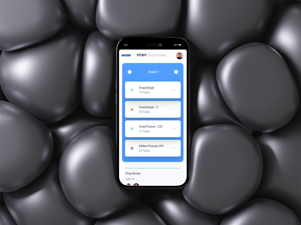
AMGEN
Scientific Reporting Platform (Study Drug Planning) for CDPH (California Department of Public Health), allowing users to easily check and locate schools or facilities within a specified region.
publish date
May 30, 2020
project type
Web APP Design
client
Amgen
About AMGEN
Scientific Reporting Platform (Study Drug Planning) for CDPH (California Department of Public Health), allowing users to easily check and locate schools or facilities within a specified region.
concept
Create a minimalist, intuitive Chat AI dashboard that enhances usability while maintaining a clean and modern design.
challenge
Balancing simplicity with functionality, ensuring a seamless user experience without clutter or unnecessary complexity.
solution
A streamlined interface with foldable navigation, clear hierarchy, and an efficient layout that prioritizes usability and key features.
Michael Jordan, Manager
“I am a scientist. I need to report and track my work day to day.”
Frustrations
- Interface.
- Validation of my user.
- Multiple applications opened.
- No Sort.
- Multiple browsers opened.
Demographics
Age: 25 – 40
Education: Degree in Business
Occupation: Manager
Tech literate: California Basic
Core needs
- Time-consuming document search.
- Accuracy of data.
- Limited collaboration capabilities.
- Lack of a centralized system.

Thought-provoking questions to spark meaningful discussions.
What exactly audience expect or look for?
- What are your primary responsibilities?
- How do you currently access and manage research data?
- What challenges do you face with the current systems?
- How do you verify the accuracy of your data?
- What features would enhance your workflow?
- Describe your ideal user experience with a research platform.
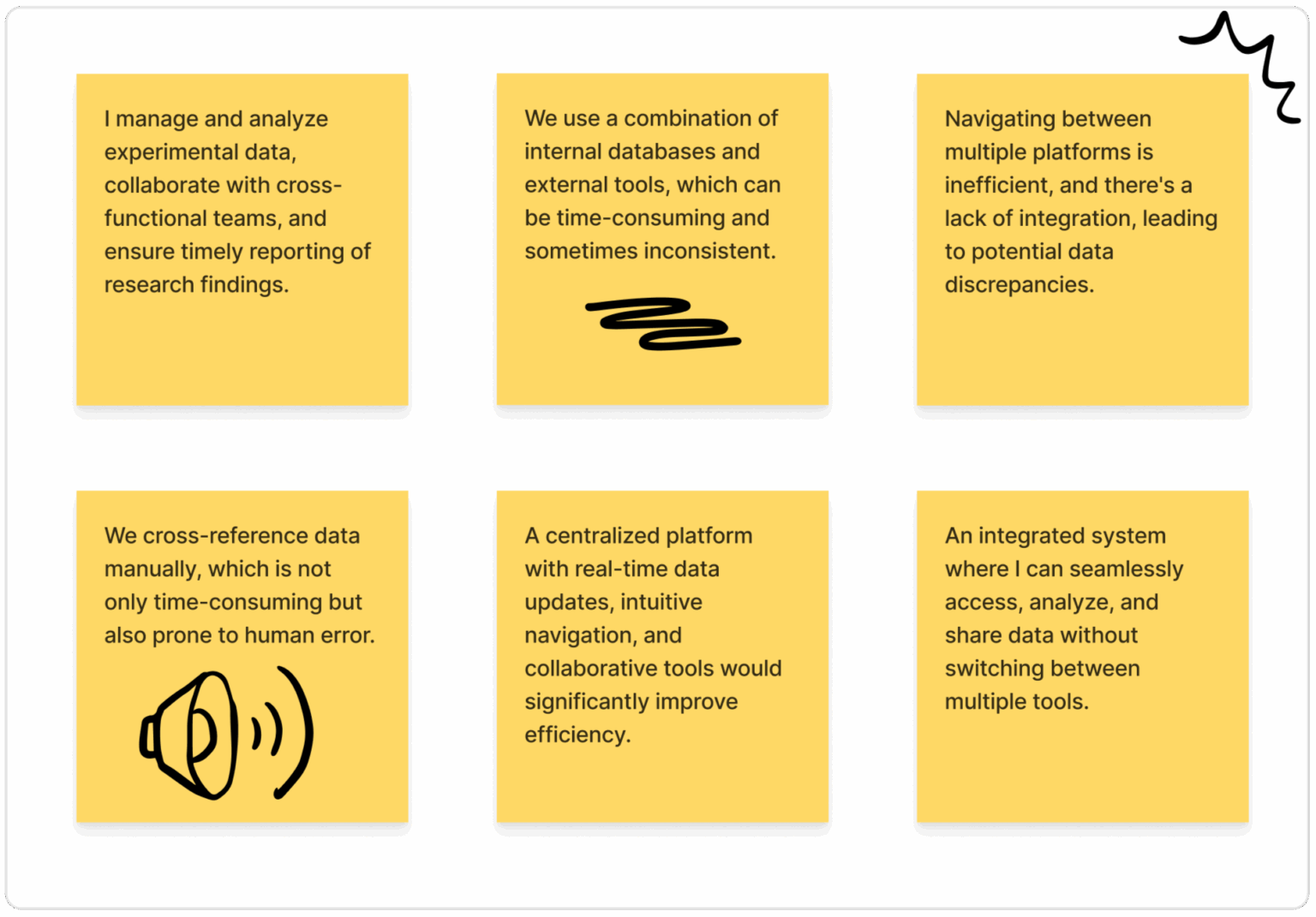
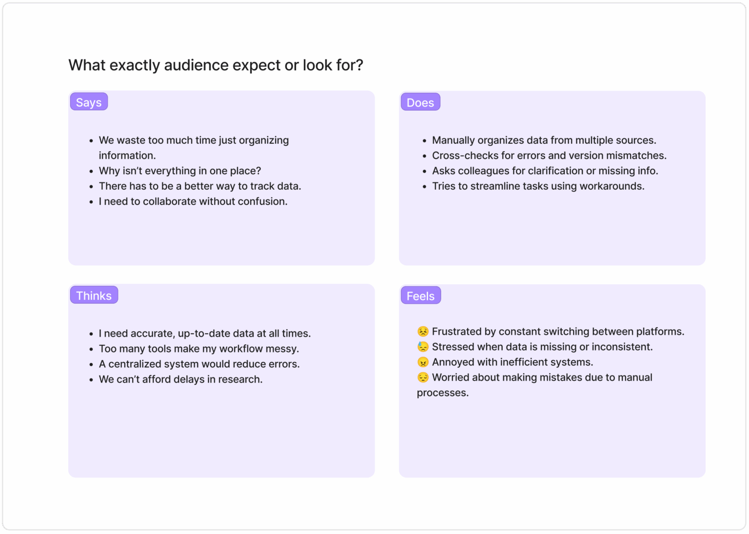
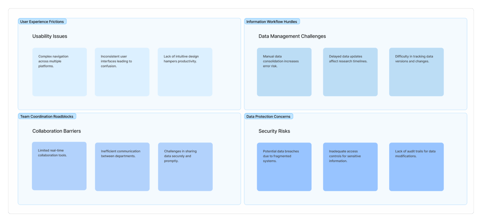
This section highlights the key frustrations and challenges users face, such as dealing with outdated systems, manual data entry, and lack of timely communication. Users express a need for automation, accuracy, and simpler tools, while feeling stressed, overworked, and concerned about making mistakes. Understanding these pain points is crucial for designing a more supportive, efficient, and user-friendly solution.
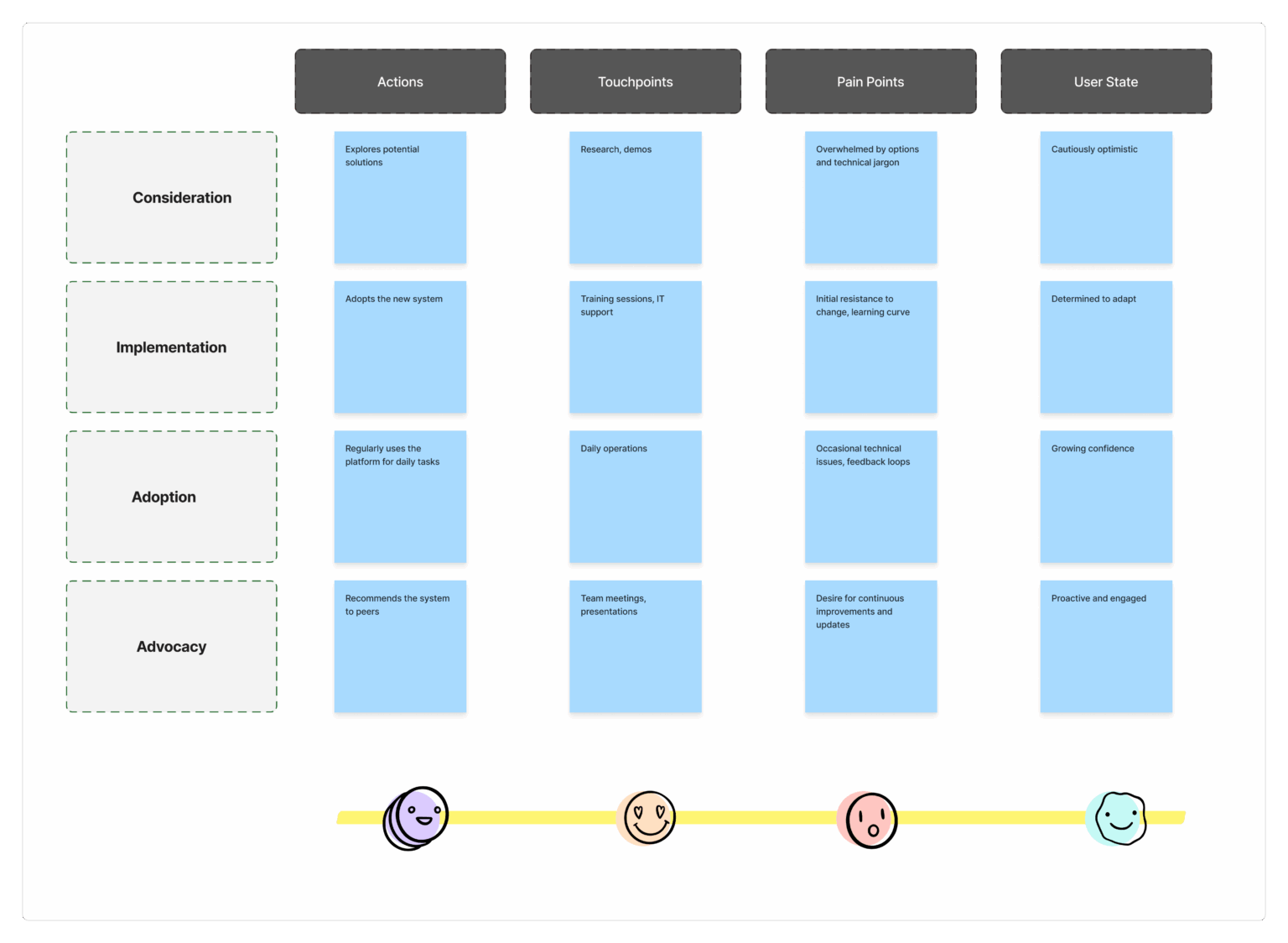
Understanding the users' needs, feelings, and behaviors to design a more intuitive and effective experience for those navigating immunization data.
Empathy Map
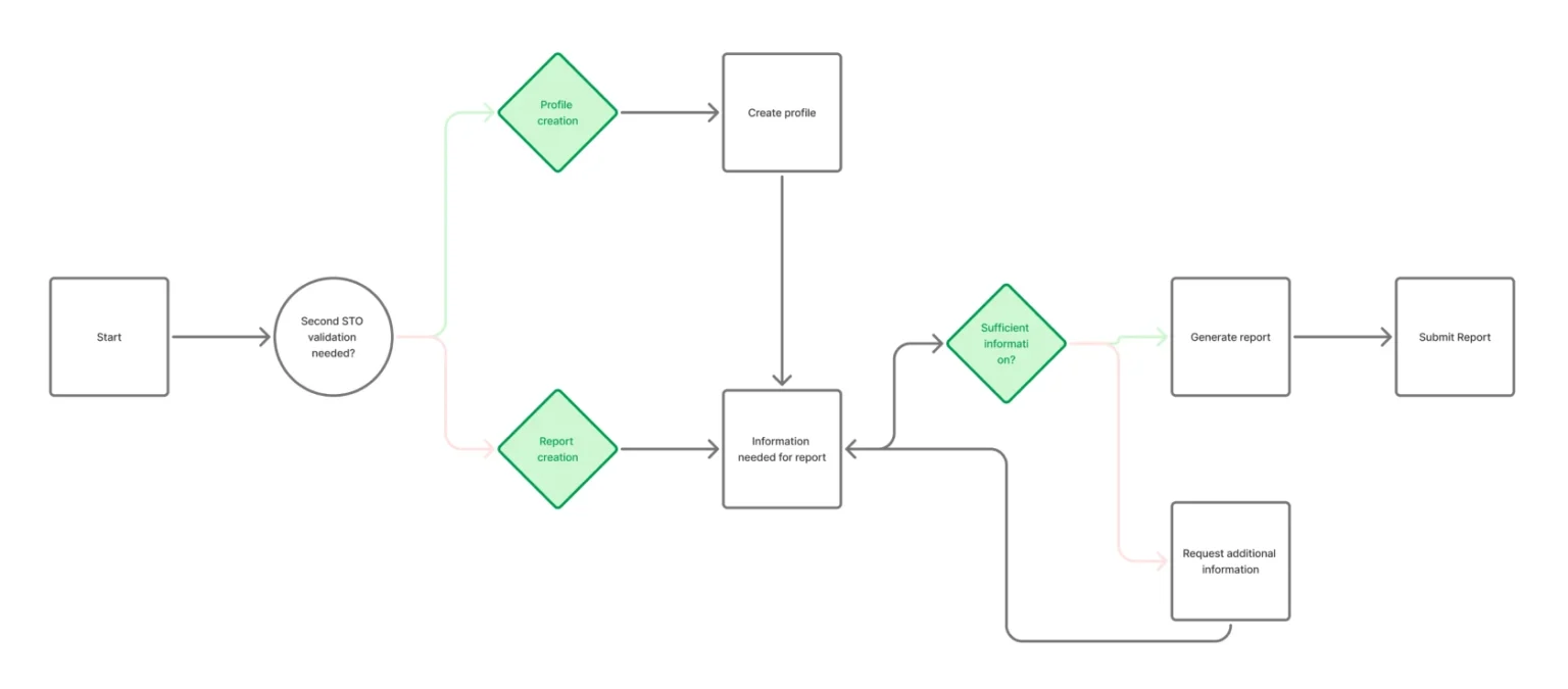
This section maps out each step users take—from receiving immunization forms to submitting reports—revealing where they face delays, confusion, or extra work. It helps identify opportunities to improve the experience with clearer steps and smarter tools.
A user journey flowchart visually represents the sequence of interactions a user has with a product or service, illustrating their experience from initial contact to the accomplishment of goals.
User Journey Flowchart
More about us
Test Reports
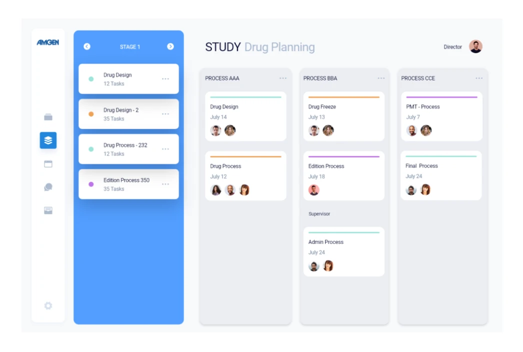
Streamlined search functionality, allowing users to easily check and locate schools or facilities within a specified region. Once a school is selected, the interface provides an intuitive editing platform, enabling users to update relevant information such as vaccine records for each grade. Comprehensive reporting section that displays the current number of vaccines administered and highlights any missing vaccines for each grade, facilitating efficient monitoring and management of vaccination data.
- Easy to access
- Easily go through grades
- Intuitive forms
- Save and come back later
Admin Capabilities
Admin Dashboard
The admin dashboard offers a centralized interface for real-time oversight of multiple schools or facilities, providing key metrics such as overall vaccination rates and individual site details.
More efficient
95%
Easier to use
87%
Visual style is an essential part of a project as it helps create a standardized system of colors, fonts, buttons, text input, and many other components that will be combined and displayed on user screens.
Style Guide

Poppins is a popular design tool for creating geometric sans-serif mobile apps. Its precisely crafted geometric letterforms make it ideal for both headings and body text.
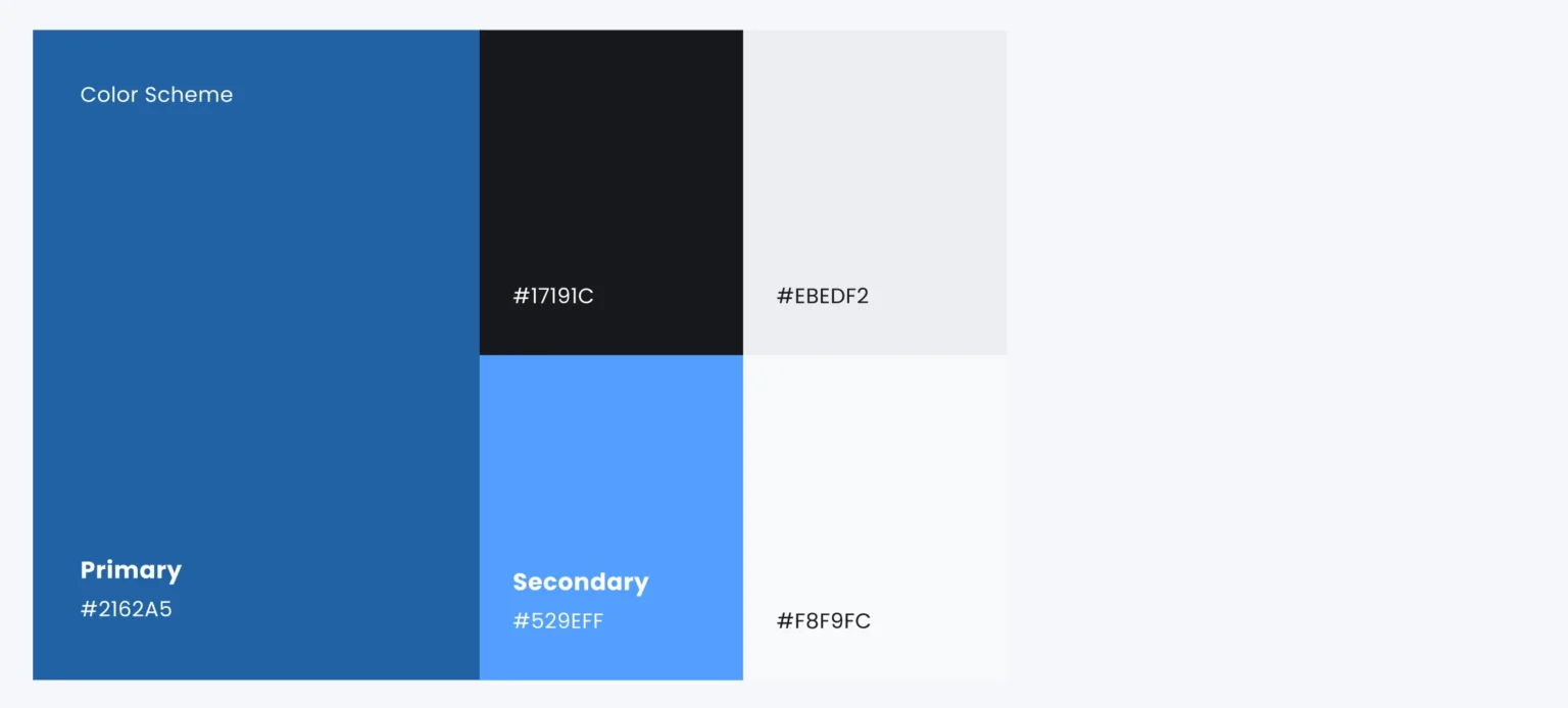
Blue is incredibly comfortable, gives a sense of security and builds trust in the product. Also, blue is often associated with depth and stability. So for the app, I chose blue as primary color, added dark blue and gray as secondary colors for making some accents, and used black and gray for the text color. Multiple colors helped to create a visual hierarchy of information.
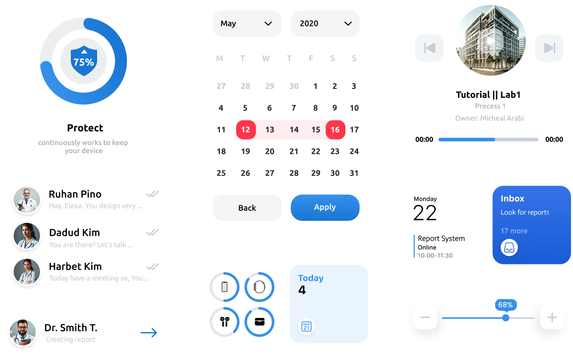
The component library was created to facilitate the interaction between designers and developers and preserve the visual concept of the application.
