CDPH
UI/UX design for CAIR Hub created for the California Department of Public Health. The California Immunization Registry Hub is a
website with centralized applications related
to statewide immunization reporting and
information for School and Child care sites.
publish date
October 1, 2023
project type
Web APP Design
client
CDPH (California Department of Public Health)
About the CAIR Hub
UI/UX design for CAIR Hub created for the California Department of Public Health. The California Immunization Registry Hub is a
website with centralized applications related
to statewide immunization reporting and
information for School and Child care sites.
concept
Develop a user-friendly CAIR Hub to centralize immunization reporting and resources for schools and childcare facilities across California.
challenge
Designing an intuitive interface that simplifies navigation while integrating multiple applications and compliance requirements.
solution
A clean, accessible UI/UX with clear workflows, intuitive data entry, and seamless access to essential immunization information.
Agathe Dufour, Manager
“I am manager and I want to process more data easily.”
Frustrations
- Interface.
- Missing data in some actions.
- Multiple browsers opened.
- No tracking system for different platforms.
- Intuitive view.
Demographics
Age: 25 – 40
Education: Degree in Business
Occupation: Manager
Tech literate: California Basic
Core needs
- Difficulty in managing the volume of dcuments.
- Lack of a centralized system.
- Time-consuming document search.
- Limited collaboration capabilities.

Thought-provoking questions to spark meaningful discussions.
What exactly audience expect or look for?
- What are your primary tasks when using the CAIR Hub?
- What do you find the most challenging about the current system?
- How do you currently solve issues like missing data or submission errors?
- What features or improvements would help you the most?
- How often do you interact with the CAIR Hub?
- What kind of support or guidance do you wish you had while using the CAIR Hub?


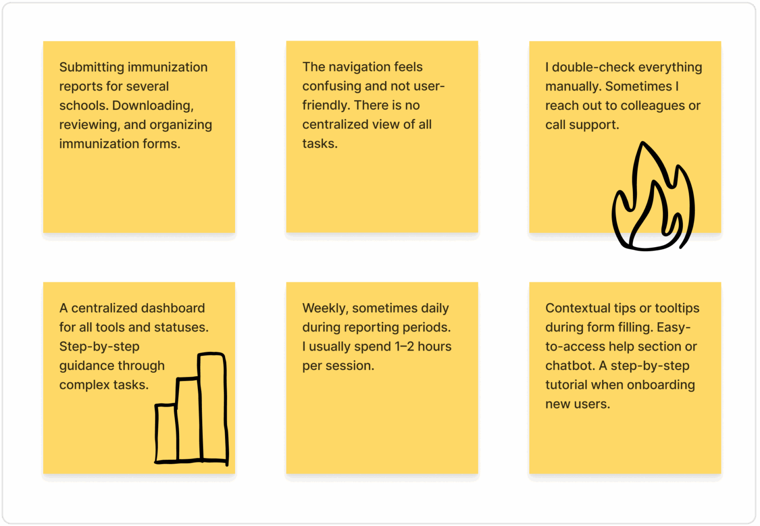
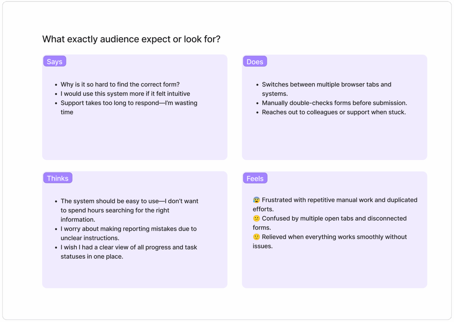
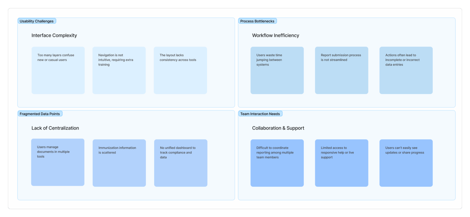
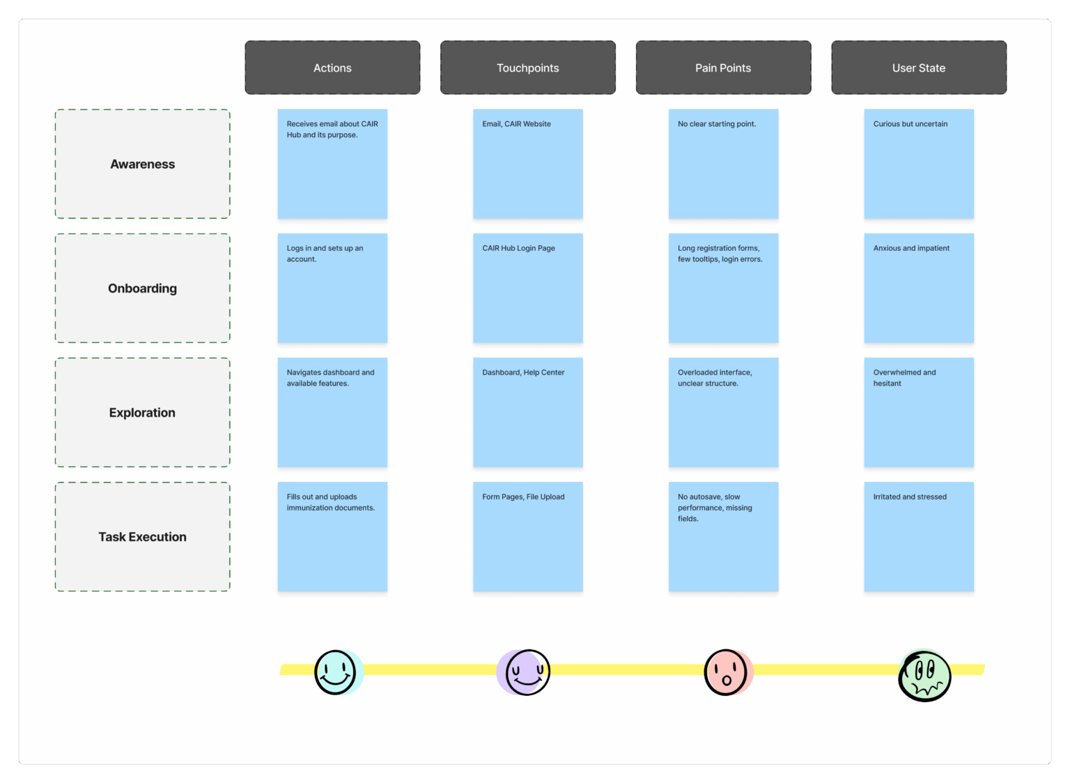
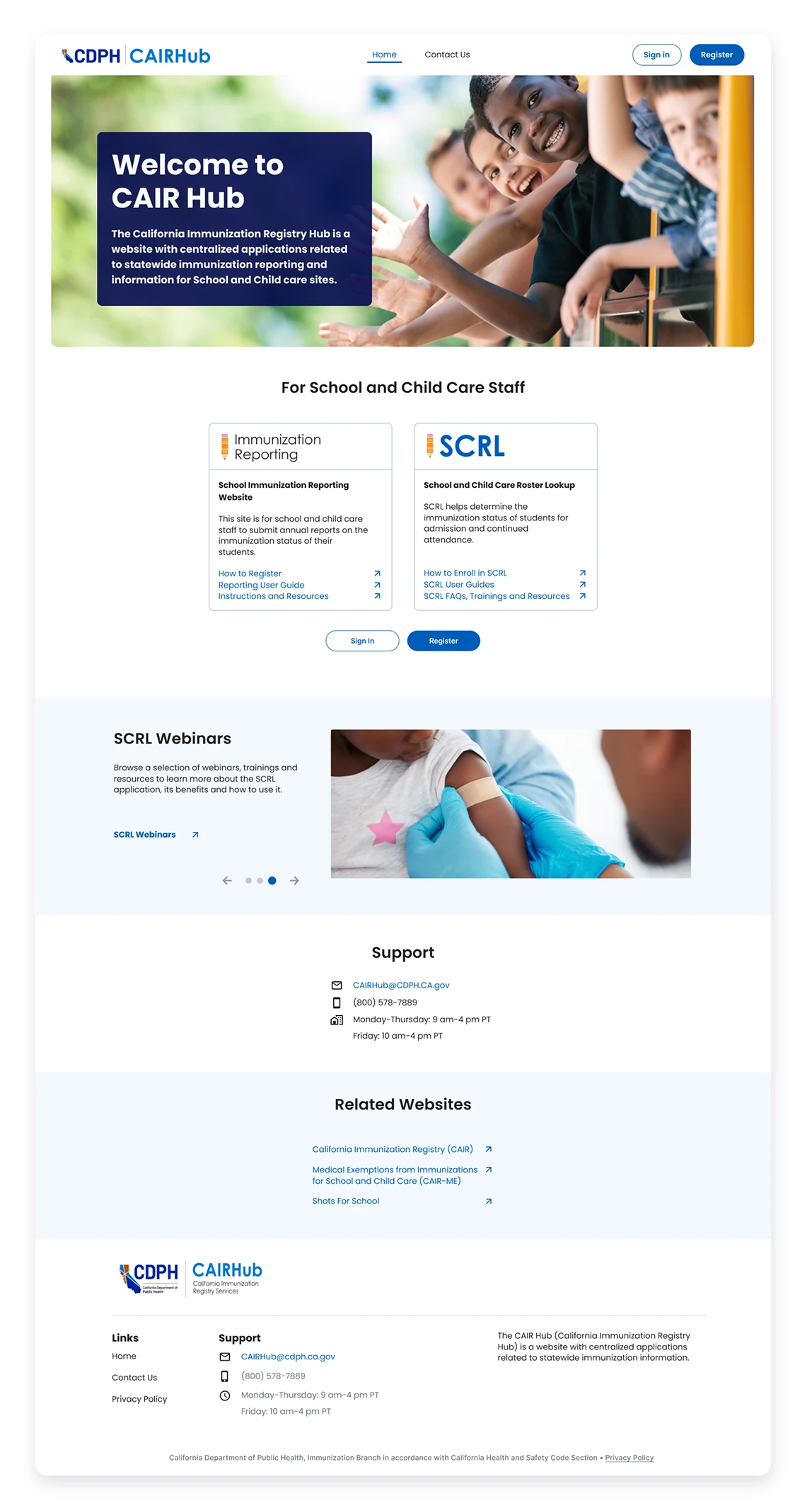
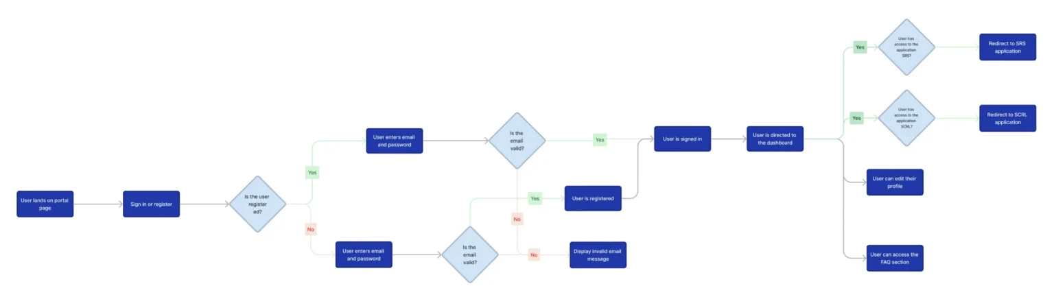
Users struggle with an unintuitive system, slow support, and repetitive manual tasks. They switch between multiple tabs, double-check forms, and often reach out for help, all while worrying about errors and a lack of clear task visibility. Streamlining the process could alleviate confusion and frustration.
Understanding the users' needs, feelings, and behaviors to design a more intuitive and effective experience for those navigating immunization data.
Empathy Map

This section maps out each step users take—from receiving immunization forms to submitting reports—revealing where they face delays, confusion, or extra work. It helps identify opportunities to improve the experience with clearer steps and smarter tools.

A sleek and intuitive wireframe UI/UX design that lays the foundation for a seamless user experience. With a focus on clear navigation, balanced spacing, and effortless interactions, it guides users naturally through the interface.
Wireframe


Complete Reimagination
Overhauled main page
The redesigned minimalistic homepage UI adopts a clean and uncluttered aesthetic, featuring a simplified layout with essential elements. Utilizing white space and a concise
navigation menu, the design focuses on key functionalities, providing users with an intuitive and distraction-free entry point
that emphasizes clarity and ease of use.
- Better conversion
- Simplified navigation
- Minimalist design
- Accessible
A user journey flowchart visually represents the sequence of interactions a user has with a product or service, illustrating their experience from initial contact to the accomplishment of goals.
User Journey Flowchart

Contact Us
The redesign prioritizes accessibility, making it easier for users to connect with the relevant departments and ensuring a more user-friendly and responsive contact experience. It provides seamless access to the Help Desk and essential CAIR Hub resources across digital platforms, enhancing both navigation and responsiveness.
- Constant Support


Logout
- Consistent image and design
Visual style is an essential part of a project as it helps create a standardized system of colors, fonts, buttons, text input, and many other components that will be combined and displayed on user screens.
Style Guide

Poppins is a popular design tool for creating geometric sans-serif mobile apps. Its precisely crafted geometric letterforms make it ideal for both headings and body text.

Blue is highly comfortable, evokes a sense of security, and builds trust in the product. It is also often associated with depth and stability. For the app, I chose blue as the primary color, complemented by dark blue and gray as secondary colors to create accents, while black and gray were used for text. This combination of colors helped establish a clear visual hierarchy of information.


The component library was created to facilitate the interaction between designers and developers and preserve the visual concept of the application.
- Informative
- Interactive carousels