CDPH – PBMS
Automatization Tracking System for CDPH (California Department of Public Health), allowing users to easily check and locate schools or facilities within a specified region.
publish date
July 3, 2021
project type
Web APP Design
client
CDPH (California Department of Public Health)
About CDPH – PBMS
Automatization Tracking System for CDPH (California Department of Public Health), allowing users to easily check and locate schools or facilities within a specified region.
concept
Create a minimalist, intuitive Chat AI dashboard that enhances usability while maintaining a clean and modern design.
challenge
Balancing simplicity with functionality, ensuring a seamless user experience without clutter or unnecessary complexity.
solution
A streamlined interface with foldable navigation, clear hierarchy, and an efficient layout that prioritizes usability and key features.
Dolores Martinez de la Fuente, Manager
“I am a manager and I require the data promptly.”
Frustrations
- Control panel.
- Data is not present in certain actions.
- Various browsers launched.
- Nomonitoring system for various platforms.
- Without Order.
- Various browsers are active.
Demographics
Age: 25 – 40
Education: Degree in Business
Occupation: Manager
Tech literate: California Basic
Core needs
- Struggles with controlling the number of documents.
- Deficiency in a cohesive system.
- Extensive document search.
- Restricted teamwork features.

Thought-provoking questions to spark meaningful discussions.
What exactly audience expect or look for?
- What is your role in managing pharmacy benefits?
- What challenges do you face with the current system?
- What would make your job easier?
- How do you usually collaborate with other departments?
- Have you used similar platforms before? What was missing?
- What’s your biggest concern when using new software?
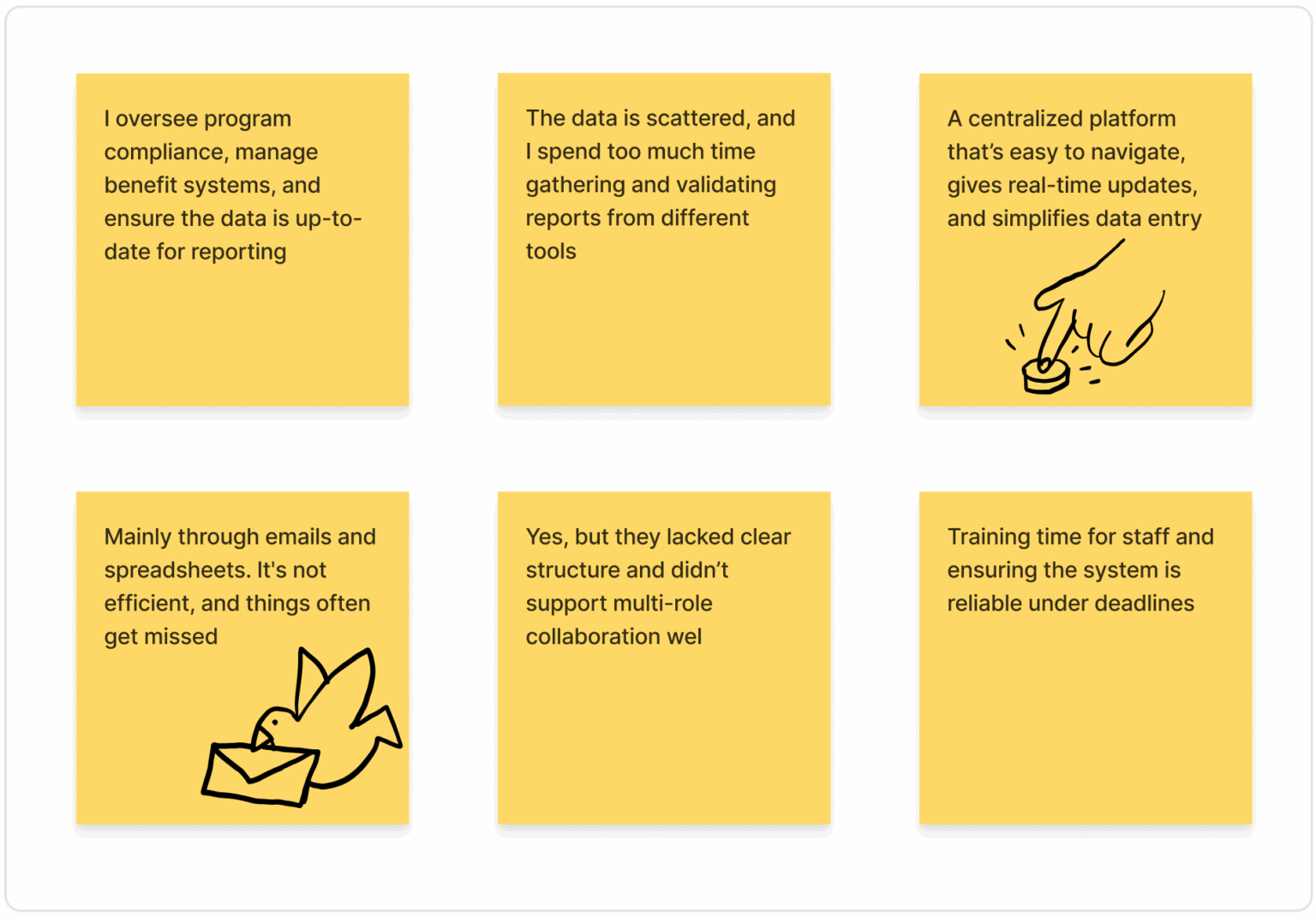
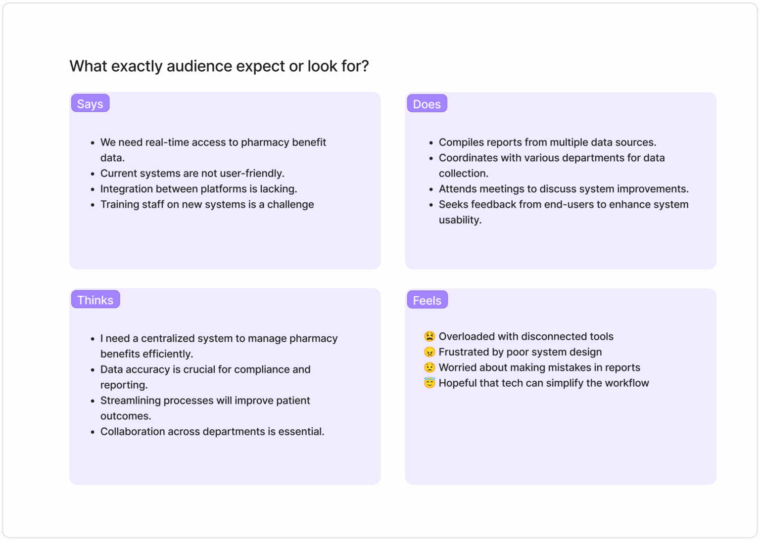
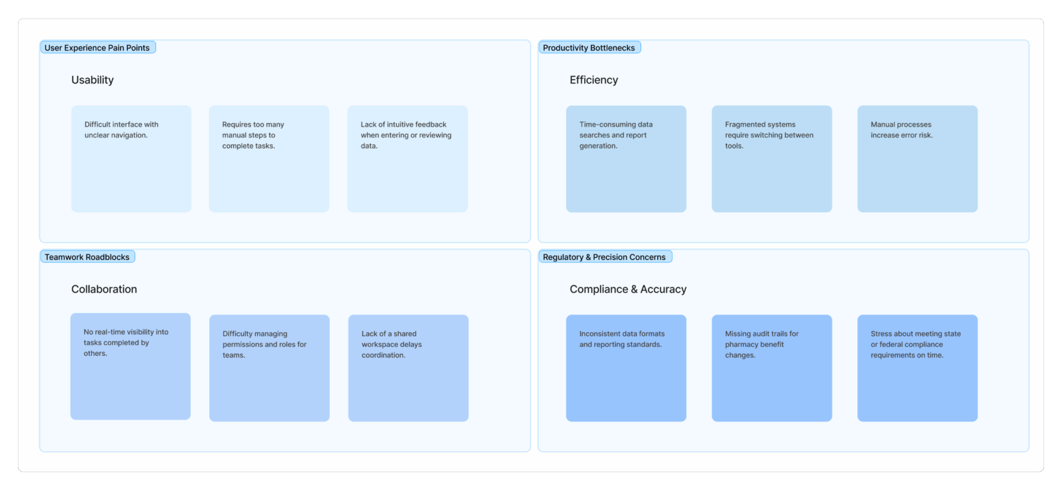
This section highlights the key frustrations and challenges users face, such as dealing with outdated systems, manual data entry, and lack of timely communication. Users express a need for automation, accuracy, and simpler tools, while feeling stressed, overworked, and concerned about making mistakes. Understanding these pain points is crucial for designing a more supportive, efficient, and user-friendly solution.
Understanding the users' needs, feelings, and behaviors to design a more intuitive and effective experience for those navigating immunization data.
Empathy Map
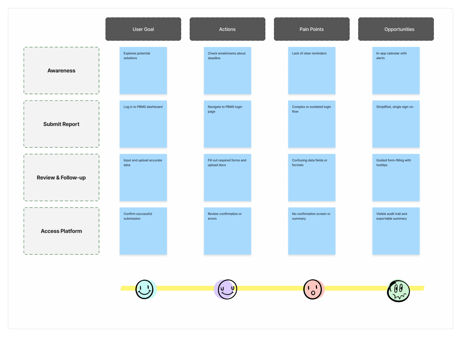
This section maps out each step users take—from receiving immunization forms to submitting reports—revealing where they face delays, confusion, or extra work. It helps identify opportunities to improve the experience with clearer steps and smarter tools.
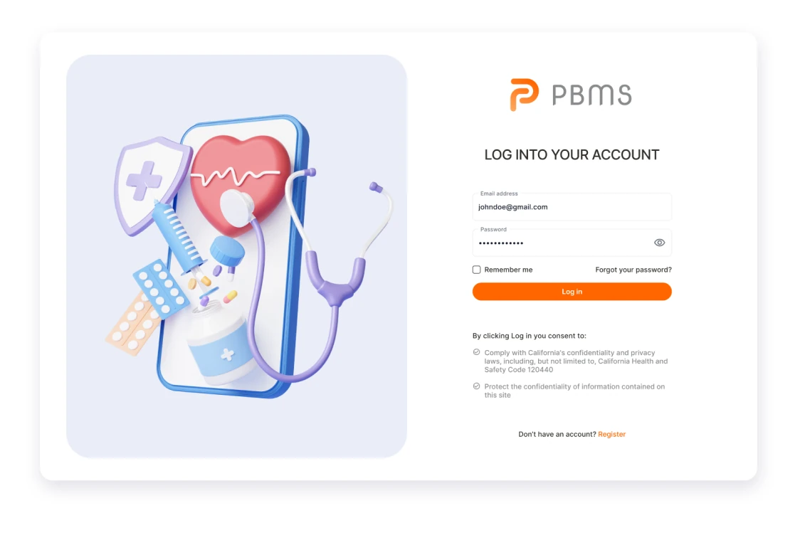
Easy as ever
Simplified Onboarding
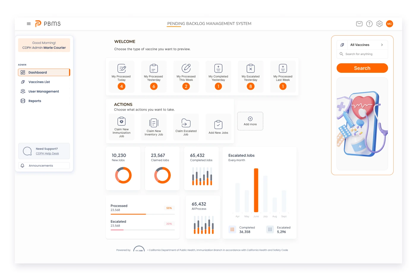
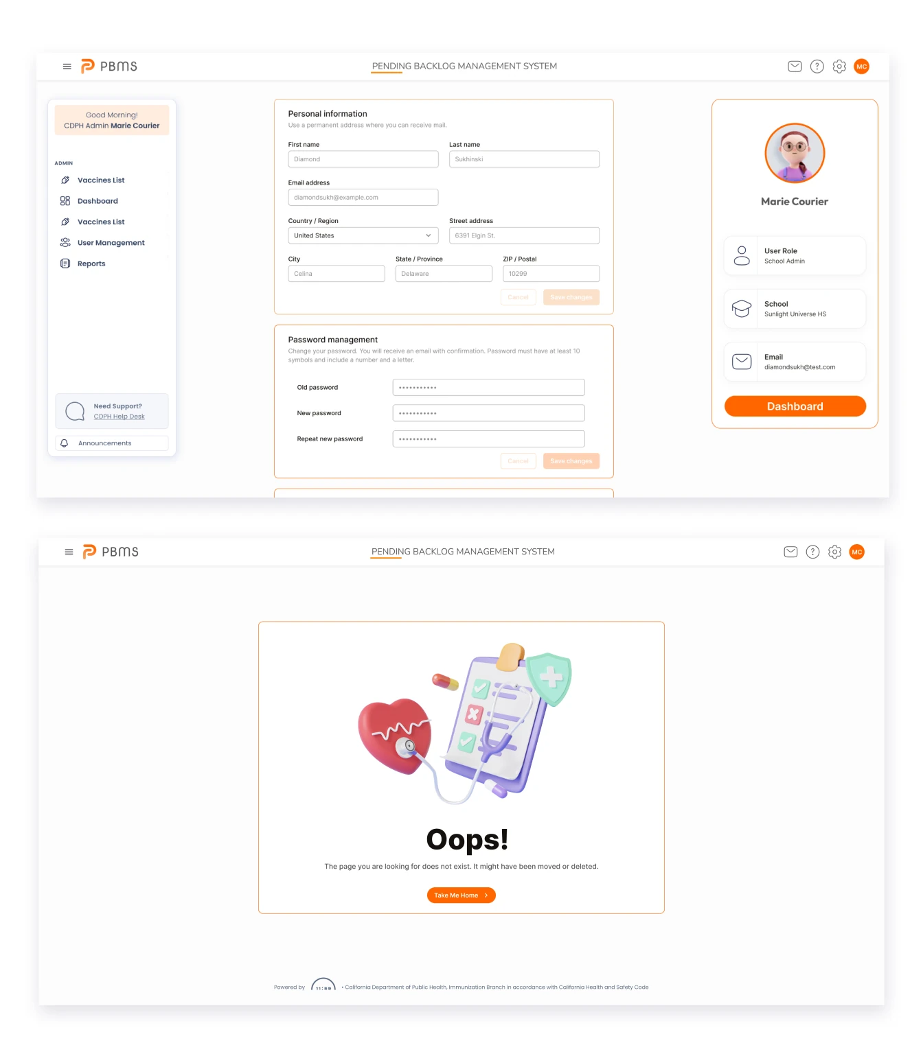
The redesigned login interface introduces a simplified and visually intuitive design, minimizing clutter and enhancing user experience. The user-friendly redesign aims to reduce friction, providing a seamless entry point and smoother onboarding for new users. The dashboard's easy and simple redesign prioritizes a clean layout, presenting essential information at a glance with intuitive visual elements. Streamlined navigation ensures effortless access to key features, while a minimalist design eliminates unnecessary complexity.
- Quick to access
- No friction
- Streamlined navigation
- Minimalist design
Simple and powerful
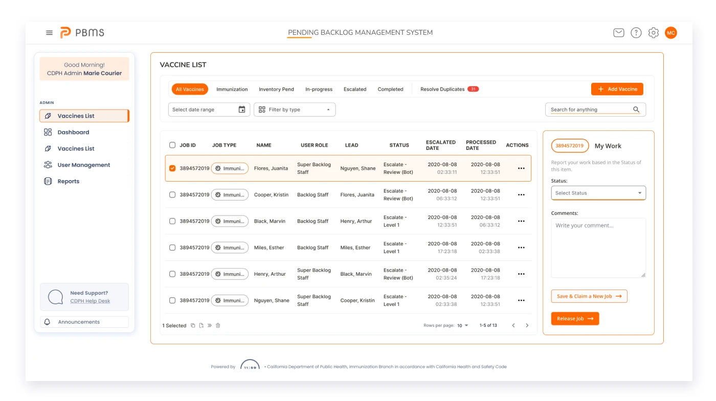
Manage vaccine copies
Users can easily identify and select specific datasets, with a visual representation that allows for quick comparison of vaccination records. The management features include tools for merging or updating duplicate data, ensuring a streamlined and organized process for handling multiple copies of vaccine information within the system.
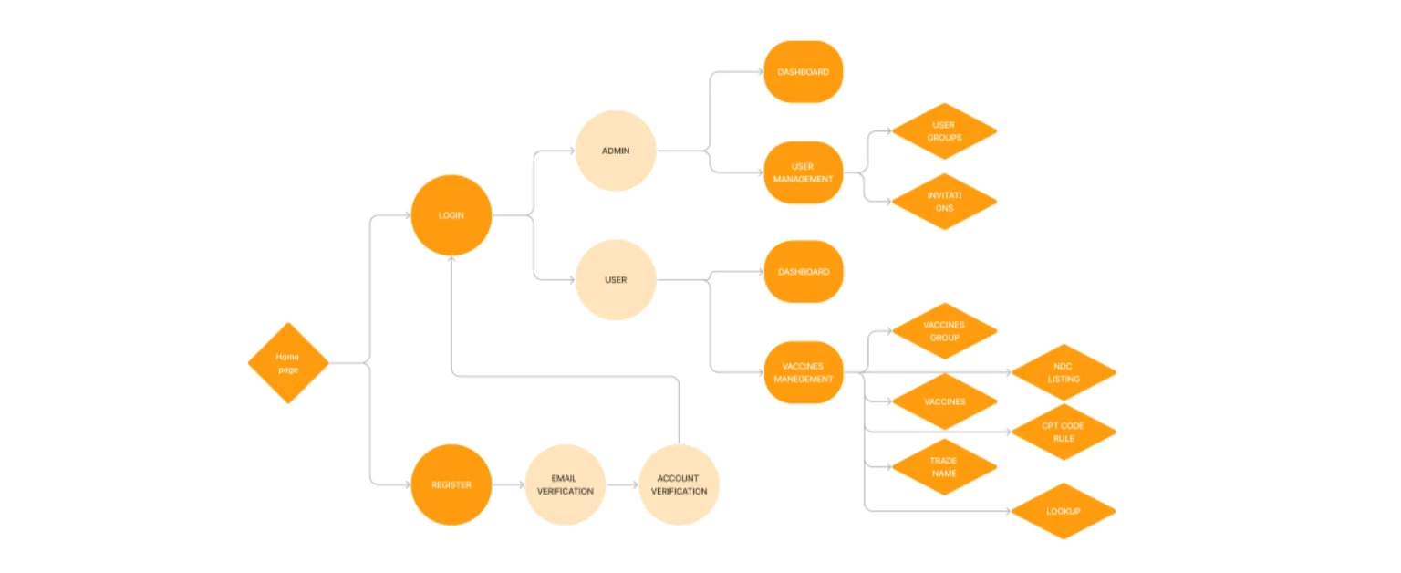
A user journey flowchart visually represents the sequence of interactions a user has with a product or service, illustrating their experience from initial contact to the accomplishment of goals.
User Journey Flowchart
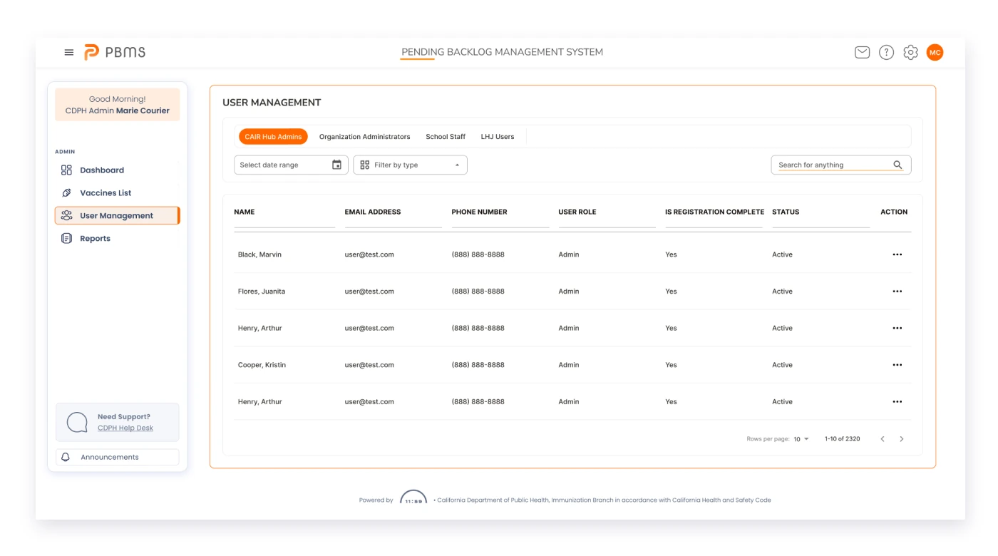
User settings
Improved customization
Customize important notifications and your general profile, navigate to the settings menu where you can personalize notification preferences of alerts you wish to receive, and tailor your profile information, including details such as contact information and occupation.
Style Guide
Visual style is an essential part of a project as it helps create a standardized system of colors, fonts, buttons, text input, and many other components that will be combined and displayed on user screens.
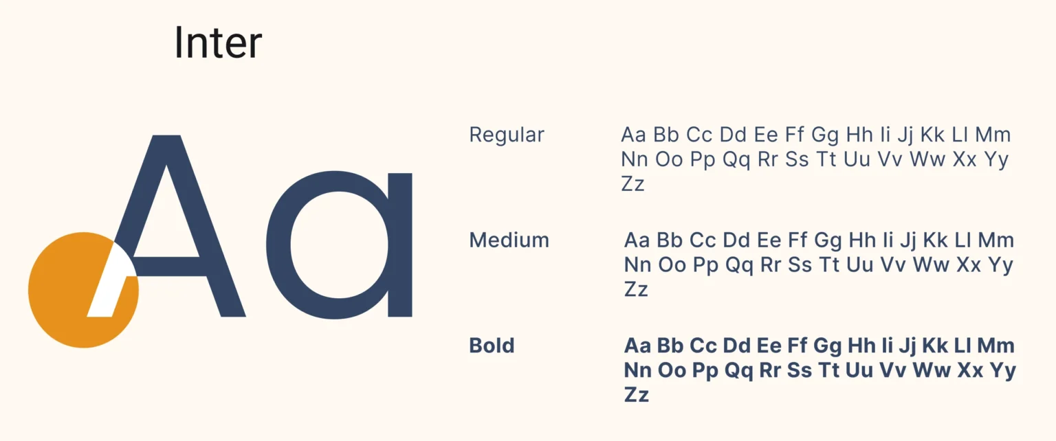
Inter is a versatile and modern sans-serif typeface designed for optimal readability across various digital interfaces, characterized by its balanced proportions and clean, geometric shapes.

Yellow is incredibly comfortable, gives a sense of security and builds trust in the product. Also, blue is often associated with depth and stability. So for the app, I chose blue as primary color, added dark blue and gray as secondary colors for making some accents, and used black and gray for the text color. Multiple colors helped to create a visual hierarchy of information.
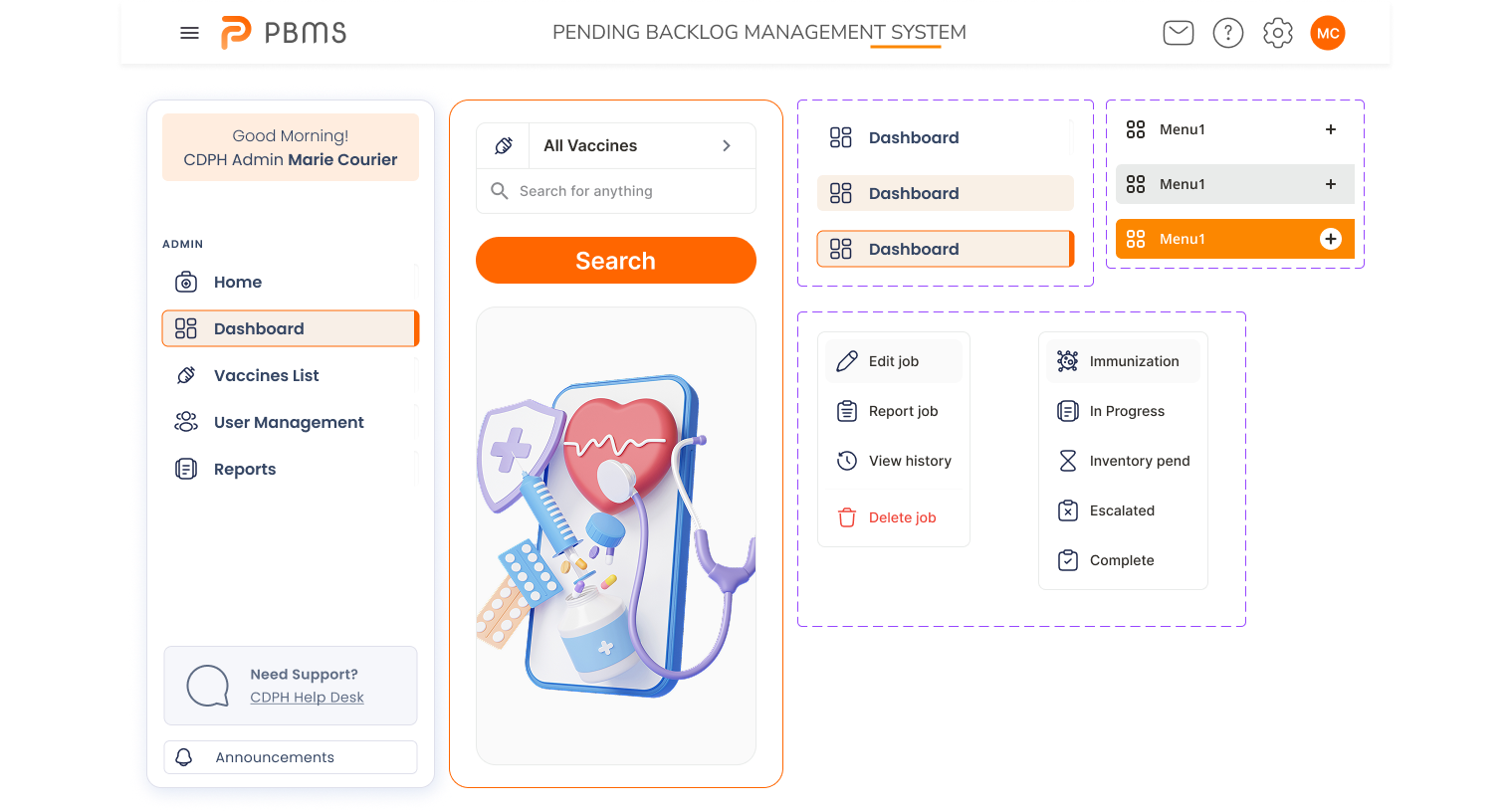


The component library was created to facilitate the interaction between designers and developers and preserve the visual concept of the application.
- Informative

