Morpheo AI
Morpheo AI Cloud Services accelerate innovation and enhance operational flexibility. Through close collaboration with AWS, we have developed intelligent tools and methods that streamline project timelines and improve operational outcomes for your organization.
publish date
September 10, 2022
project type
Web APP Design
client
Morpheo AI
About Morpheo AI
Morpheo AI Cloud Services accelerate innovation and enhance operational flexibility. Through close collaboration with AWS, we have developed intelligent tools and methods that streamline project timelines and improve operational outcomes for your organization.
concept
Create a minimalist, intuitive Chat AI dashboard that enhances usability while maintaining a clean and modern design.
challenge
Balancing simplicity with functionality, ensuring a seamless user experience without clutter or unnecessary complexity.
solution
A streamlined interface with foldable navigation, clear hierarchy, and an efficient layout that prioritizes usability and key features.
Jonathan Magnet, Manager
“As an entrepreneur, I seek to handle data more easily.”
Frustrations
- Interface.
- Missing Data in some actions.
- Multiple browsers opened.
- No tracking system for different platforms.
Demographics
Age: 25 – 40
Education: Degree in Business
Occupation: Manager
Tech literate: California Basic
Core needs
- Difficulty in managing the volume of documents.
- Lack of a centralized system.
- Time-consuming document search.
- Limited collaboration capabilities.

Thought-provoking questions to spark meaningful discussions.
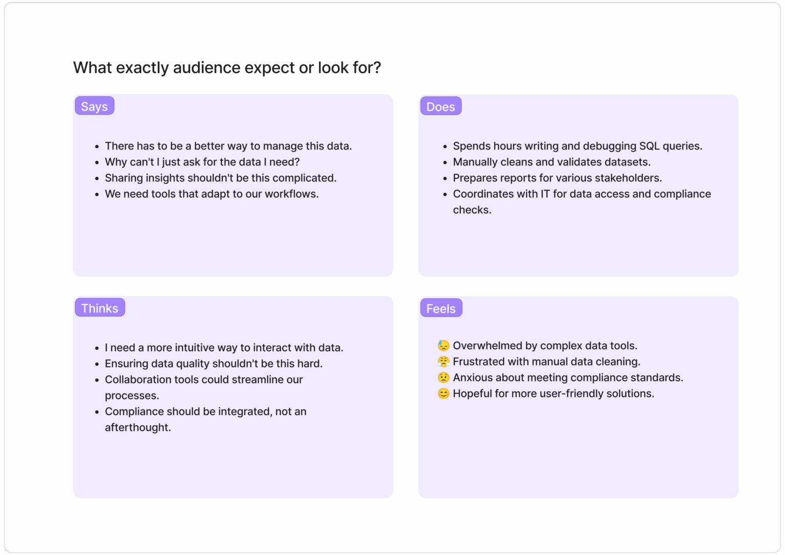
What exactly audience expect or look for?
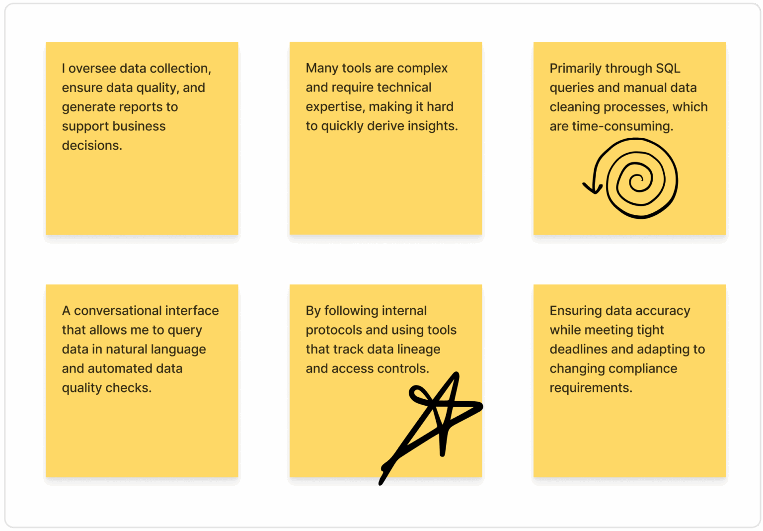
- What is your primary role concerning data management?
- What challenges do you face with current data tools?
- How do you currently interact with data systems?
- What features would enhance your workflow?
- How do you ensure data compliance and governance?
- What is your biggest concern regarding data management?
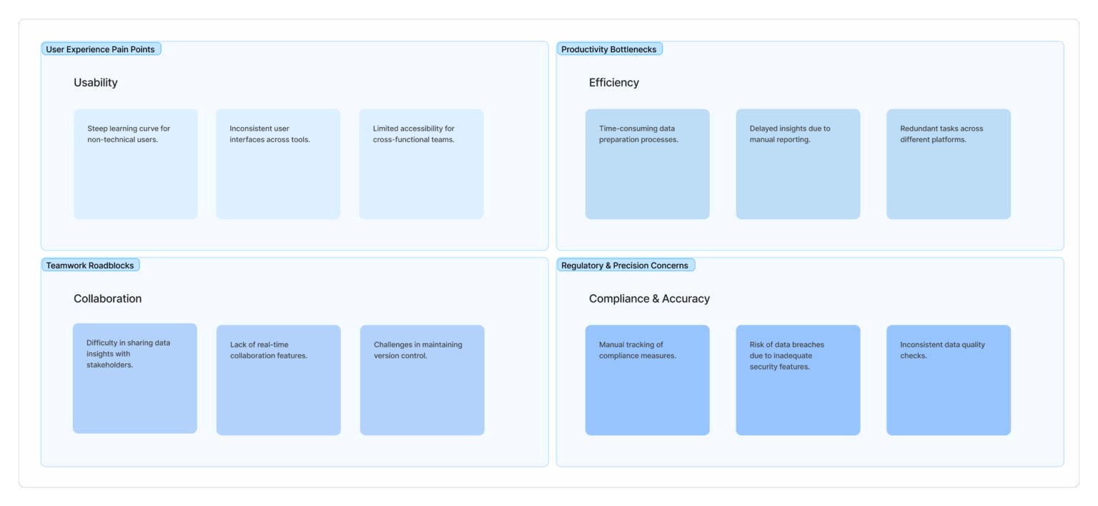
This section highlights the key frustrations and challenges users face, such as dealing with outdated systems, manual data entry, and lack of timely communication. Users express a need for automation, accuracy, and simpler tools, while feeling stressed, overworked, and concerned about making mistakes. Understanding these pain points is crucial for designing a more supportive, efficient, and user-friendly solution.
Understanding the users' needs, feelings, and behaviors to design a more intuitive and effective experience for those navigating immunization data.
Empathy Map
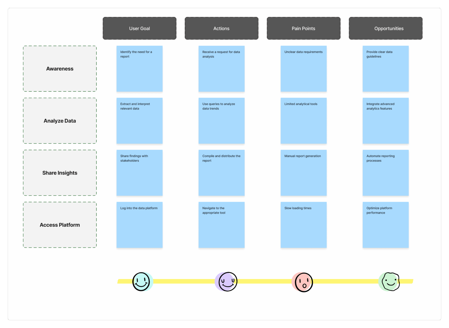
This section maps out each step users take—from receiving immunization forms to submitting reports—revealing where they face delays, confusion, or extra work. It helps identify opportunities to improve the experience with clearer steps and smarter tools.

Complete Reimagination
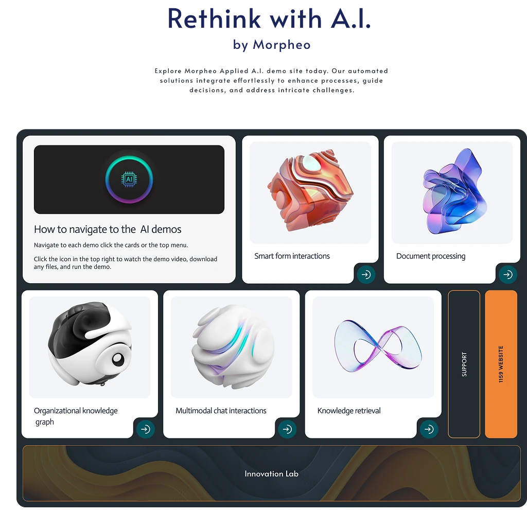
Revamped front page
The revamped simplistic homepage interface embraces an elegant and tidy appearance, showcasing an essential-layout with crucial components. Employing white space and a brief navigation menu, the layout emphasizes key functions, offering users an easy and distraction-free entrance that highlights simplicity and usability.
- Better conversion
- Simplified navigation
- Minimalist design
- Accessible
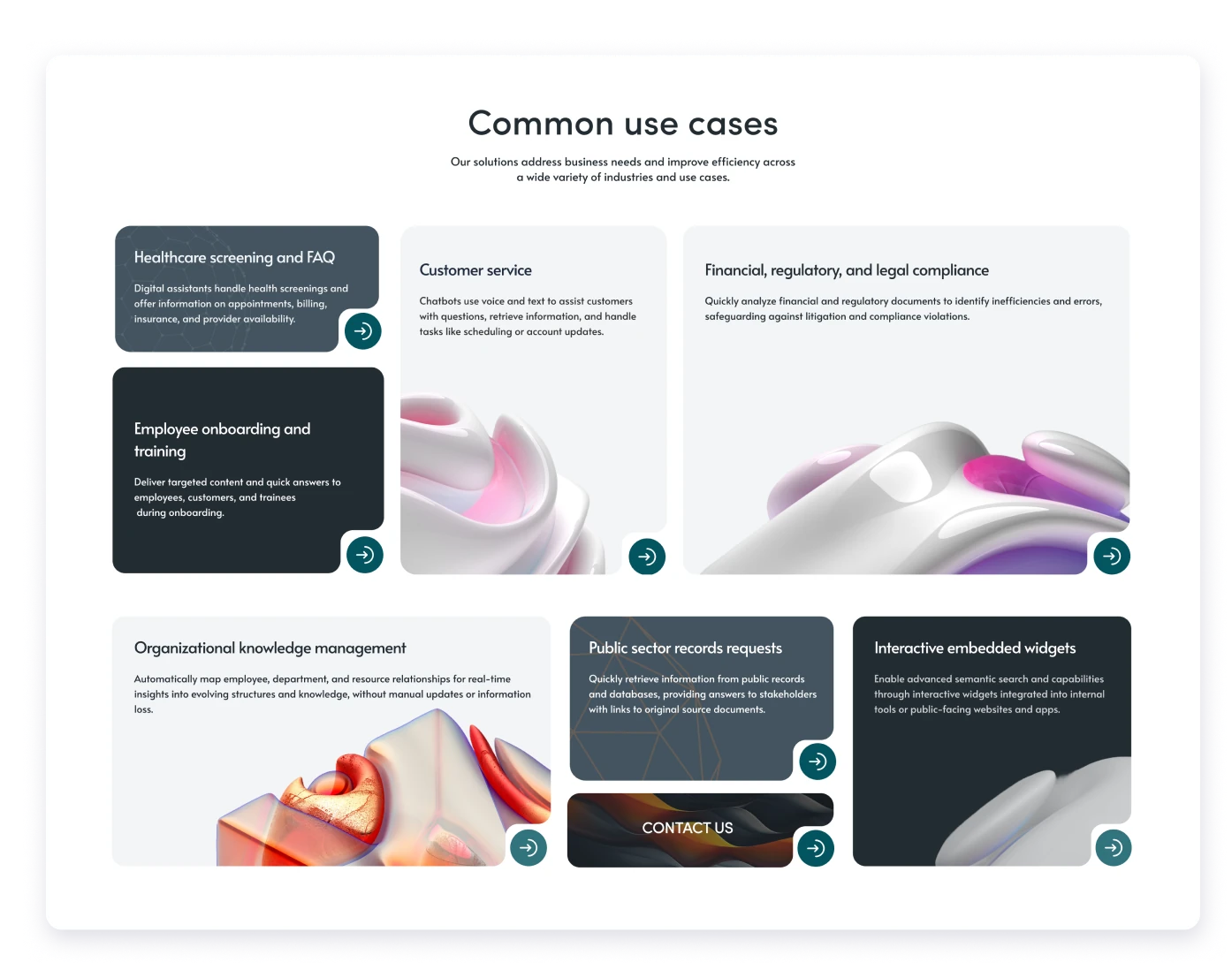
Cohesive Dashboard
Morphing shapes
Aligning with the homepage’s evolving design, the refreshed dashboard features a cohesive, streamlined look. It prioritizes functionality, offering a clean interface with collapsible, intuitive navigation. This structure ensures efficiency and ease of use.
- Comprehensive
- Modern Interface
A user journey flowchart visually represents the sequence of interactions a user has with a product or service, illustrating their experience from initial contact to the accomplishment of goals.
User Journey Flowchart

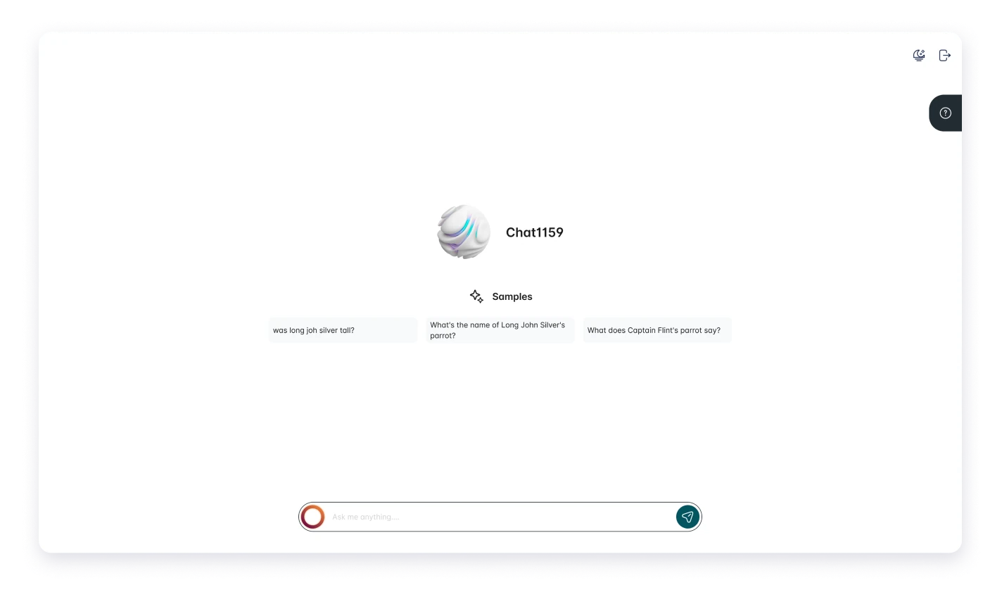
Constant Support
Shortcuts
The makeover emphasizes accessibility and shortcuts, ensuring users can easily engage with pertinent departments, promoting a more user-friendly and interactive contact experience.
- Visual Feedback
- Polished & Professional
Visual style is an essential part of a project as it helps create a standardized system of colors, fonts, buttons, text input, and many other components that will be combined and displayed on user screens.
Style Guide
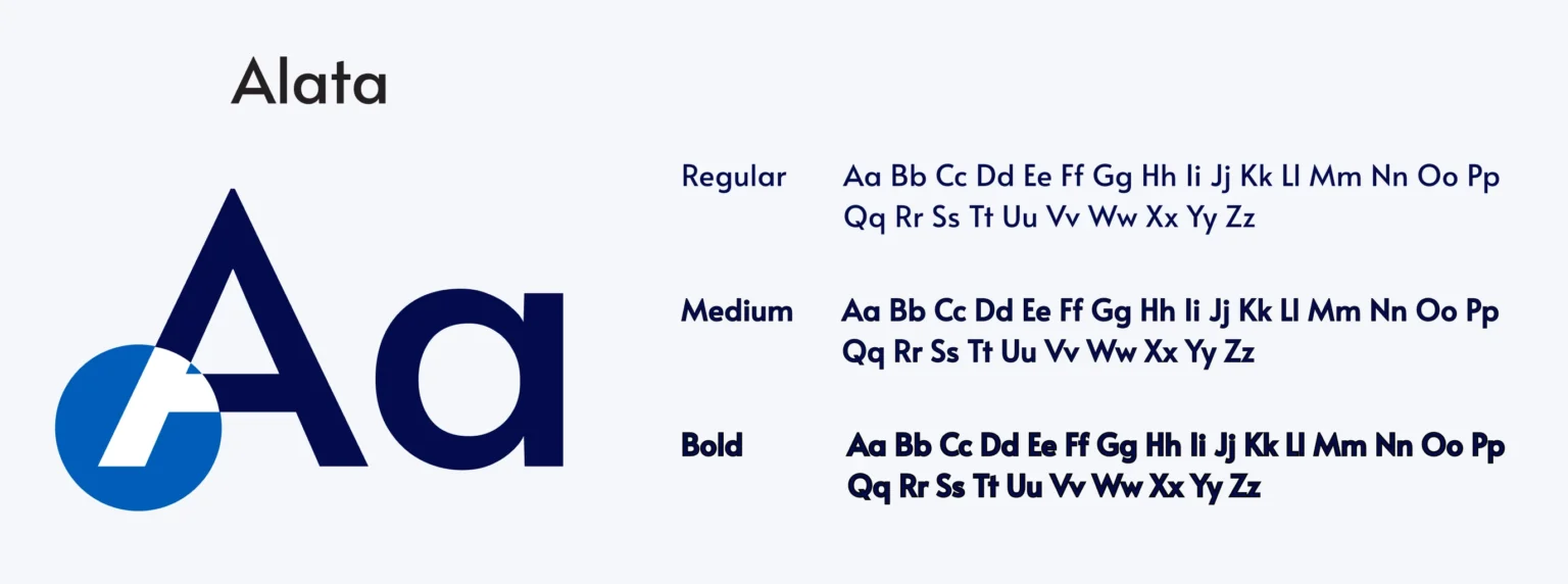
Alata ranks among favored tools for developing geometric sans serif applications. Its accurate geometric structure suits both headings and body content.

Black and Orange feel extremely comfortable, imparting security and fostering product trust. Additionally, blue commonly represents depth and stability. Therefore, for the app, I selected blue as the main color, incorporated dark blue and gray as accent colors, and chose black and gray for text color. Various colors aided in crafting a visual information hierarchy.
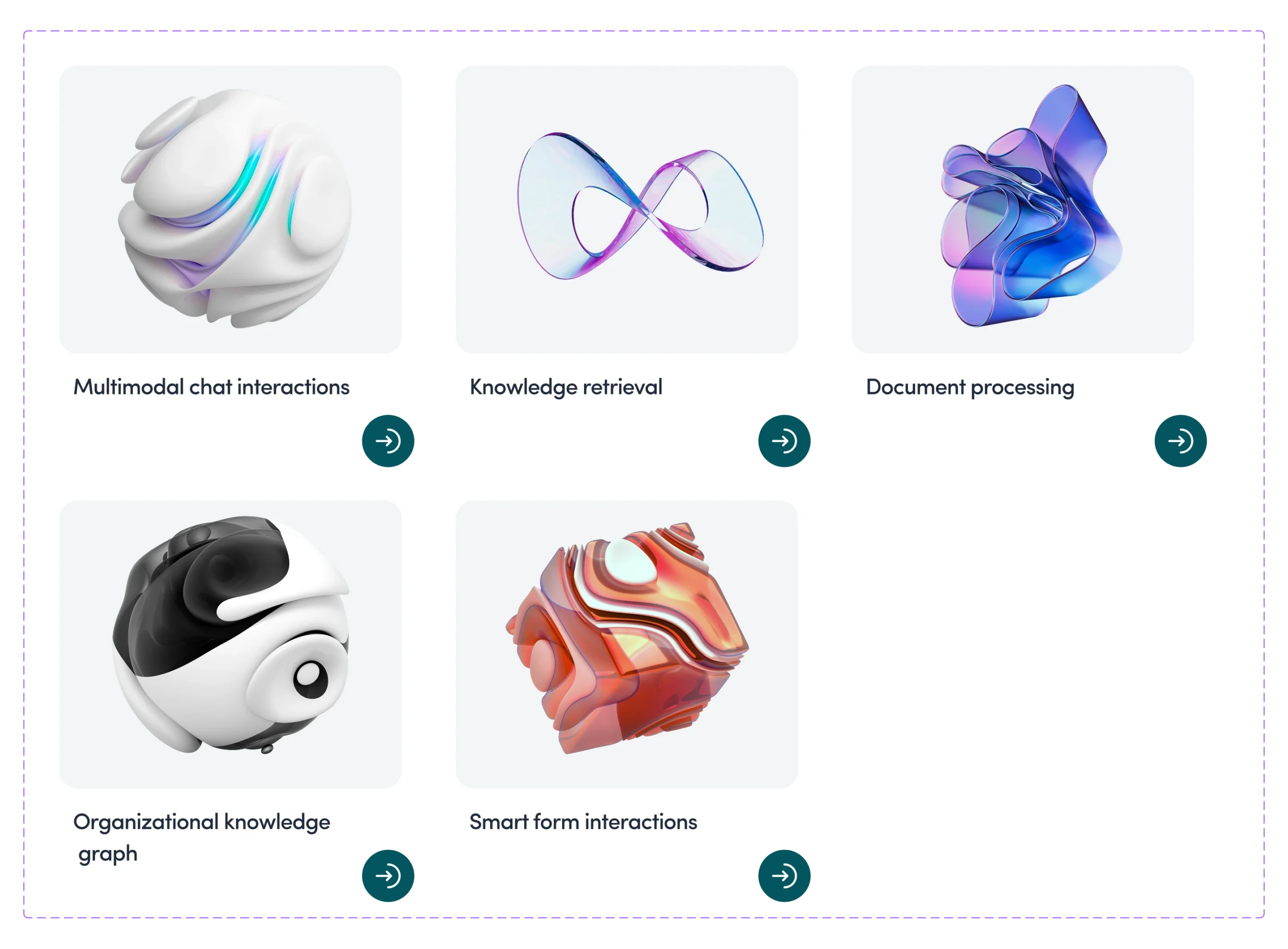

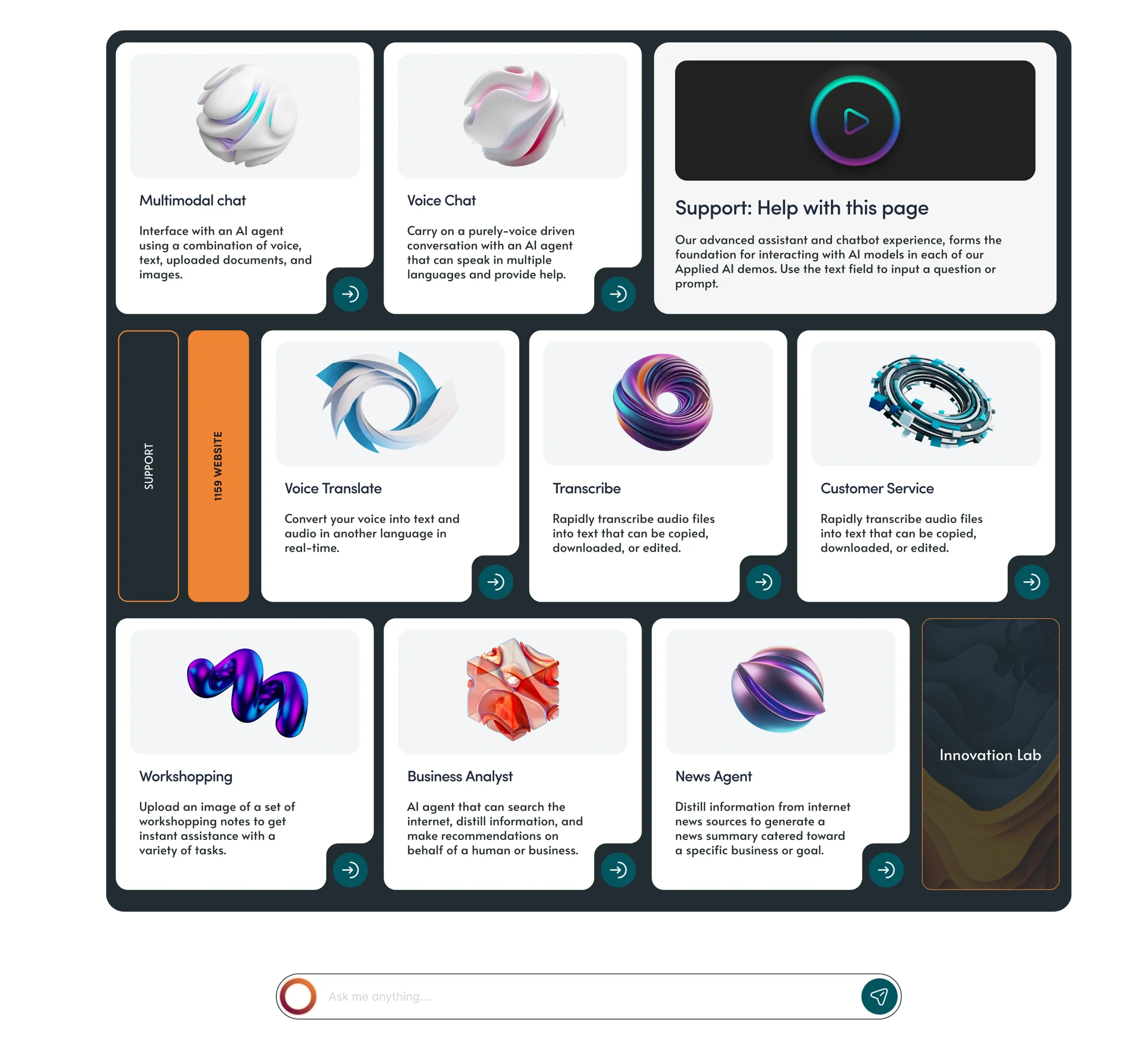
The component library was created to facilitate the interaction between designers and developers and preserve the visual concept of the application.
- Informative
- Interactive carousels

